I apologize for not posting much lately. I've recently become busy with a new project. Over the past several months I've been trying to post interesting things on a somewhat regular basis, but I'm afraid I might need to make the jump to another platform in the near future as Blogger might be growing obsolete. Even if that happens, I'll keep writing here, too.
Anyway, today I'd like to share what it's like to sell original art and what happens to it afterwards. Despite the fact that I've been working professionally as an artist for fourteen years now, it's still thrilling to make an art sale. It means a lot that someone is willing to spend their hard-earned money to hang a picture I've made up in their house. Interacting with fans and knowing that someone has formed a connection with one of my paintings is what helps to keep me moving forward during the moments of doubt and despair I might be feeling about my artwork. I'm guessing this is a feeling shared by many artists.
Gen Con is an interesting situation because Vinod and I have to travel by plane to the show, so we're unable to bring pieces framed. That means we can price them a bit lower, but the framing is up to the buyer. In this instance, the buyer was interested in having me frame the painting and ship it when it was ready. I was happy to oblige and it was fun picking out mat and frame options for the piece.
The narrowed down frame and mat combinations.
The finished product can be seen below. The natural wood grain of the walnut frame complemented the warm browns in the painting beautifully. To read a little more about the framing process, check out the story posted at Mainframe.
Here are a couple more photos people have shared of my paintings they've purchased:
I'm excited to announce I've finally made another sketchbook! My last sketchbook, Journey, was printed in 2009. It seemed like the right time to put together a new one.
The fourth in my series of sketchbooks, Fabled Earth has a color wrap-around cover featuring a new painting, and 68 pages packed with character and creature designs, rough sketches, finished drawings and even a couple illustrations in full color. The book's content spans the last several years' worth of my drawings for clients such as Cricket Magazine and Paizo, as well as personal work and development sketches for The Explorer's Guide to Drawing Fantasy Creatures. The matte finish on both the cover and interior pages does a nice job replicating the color of my paintings and the softness of my graphite drawings. And all the paper is recycled if you care about that sort of thing.
Each sketchbook measures 6 by 9 inches and comes signed by me.
New book!
The book has both rough development sketches and finished drawings.
An example of one of the full-color images in the book.
Pretty rocks in photo not included.
To buy a copy visit my Etsy shop, Fabled Earth Art. I will also be adding the sketchbook to my (new! improved!) website shop page soon. It will be 10% off until the end of September. Neat!
For those of you who picked up my promotional coupon at Gen Con, don't forget to enter the code when you check out on Etsy. Please note that the free shipping offer ends on September 30th, 2015. If you choose not to order on Etsy, once I put the book up for sale on e-figart.com just include a note to me with the coupon code and I will honor it.
The Marriage is a Work of Art show has come to a close and my painting "Children of the Forest" has gone to its new home. I haven't made a process post in a while, so I thought I would share how this painting came together.
When we were invited to exhibit in the Marriage show I wanted to come up with a way that Vinod and I could tie our work together other than the incidental ties our art has as a result of our relationship as artists over the past 20 (!) years. I didn't want to just hang whatever it was that we had been working on lately and call it a day. We don't really collaborate on artwork other than offering each other critiques and we definitely don't work on the same painting together. (I don't know how Leo and Diane Dillon did it!)
Last fall, Vinod had painted a personal piece called "The Green Man." I was looking at it hanging on the wall in our studio one evening and decided that I could do a companion piece that would complement his painting and form the centerpiece of our wall at the Marriage is a Work of Art show.
"Children of the Forest" embodies many of the themes I
explore in my work: mythology, folk tales, and nature and animals seen through a
fantasy lens.
I knew the story I wanted to tell, but as I drew, other elements I did
not plan in advance developed organically, like her flower "heart."
When we moved into our house two years ago, we set up our studio in a room facing our backyard which is adjacent to a woodsy green belt. Squirrels and many species of birds visit our feeders and bird bath visible from the
window in front of my desk. This is the first time we've lived in a
house with a window looking out onto so much wildlife activity. I love it. For "Children of the Forest" I decided to paint
some of the birds that visit us I and picked a dogwood tree like the one in our yard for the dryad.
A little over a day into the painting.
A butterfly was one of the unplanned elements that revealed itself to me while I was drawing, and I decided to make it a monarch. Growing up in Michigan I would see monarchs and I remember a trip we took to look for them at Point Peele National Park, which is a rest stop for migrating butterflies.
A close up of the dryad's face.
Almost finished...
Deciding the crop of the finished painting using the mat.
This is pretty typical of the way my table looks during a project.
The title of this painting comes from a book I was referring to for bark textures, moss and general forest imagery called Secrets of the Old Growth Forest. Most of the time I was working I had the book open to a page with a photo of the massive trunk of a cedar tree. When I was finished and it was time for me to come up with a title for my piece, I happened to glance over at the open book and saw that the chapter title was "Children of the Forest." I thought it expressed the theme of my painting perfectly.
It's time to reveal the last group of character development sketches I did for Crowd Sorcery: Khaos!
The Villain: Khaos
Created by Brooke E., age 11
“The spirit of a wicked
sorcerer who was killed in a huge battle that wiped out his
monsters, he lives in a huge, ancient cave—a shrine for
worshipping Mael-Koth, the pagan god of death.”
Khaos actually appeared in the very first part of "The Girl Who Writes the Future" but not in his "true" form. He was described by his creator as "disturbingly handsome" and Fred tells us that he has "dark hair...slicked back from a face so handsome it might have been that of an angel –– except for its cruelty." I had my work cut out for me! Help me, Ayami Kojima.* You're my only hope!
When I talk about designing characters I discuss how I work on the face first so that I can feel like I know the character better before I continue the design. I usually start sketching from my imagination, but if I get stumped, or even if a face is going in a direction I like but I want to make it more distinct, I will sometimes turn to reference for inspiration.
Round one of Khaos sketches.
I did this first round of sketches from imagination. I already had a general idea of how I wanted Khaos to look and I was exploring attitude and expression. But I wanted to draw more tangible facial features, so with some reference of faces in hand I refined the character design. I also fixed his bone crown so it'd look less like it was made of french fries!
Round two, taking features I liked best from round one and refining them.
Artists often have a sort of default face that they draw. Although our
characters may be distinguishable from one another, there's a shorthand
many of us tend to use when drawing facial features. To break away from
the reliance on those stylistic tropes it's good to look carefully at
real facial features from time to time and concentrate on the way faces
are made up of an interesting variety of shapes.
The final drawing for the illustration of Khaos with his creepy crawlies.
"The Girl Who Writes the Future" by Frederic S. Durbin has just concluded its run with Part Six in Cricket Magazine's May 2015 issue. To follow the adventures of these characters pick up some issues at
the bookstore. If you missed the earlier chapters of the story you can now read the whole thing online on Cricket's Chatterbox message board or follow the instructions for downloading the digital
editions here.
*Ayami Kojima draws and paints what one might describe as disturbingly beautiful people. She is well known for her art for the Castlevania video game series.
Kiri Østergaard Leonard is a fellow illustrator interested in the world of myth and folklore. She has created an interview series that focuses on women working in the fantasy illustration field and she recently contacted me about participating. She asked many interesting questions and patiently waited for my answers.
My interview is now available to read on her website here.
Click here to see the rest of the interview series.
I hear dwarves are popular these days. Good thing, because I happen to have art of that!
The second character I designed for Unrestrained Games is an intimidating and capable fighter who leads his elite dwarven warriors into battle. To contrast from Hogoren who was heavy on the bottom, I made Downammar slightly top-heavy. His clothing and armor is fit for a king and formidable in battle.
A few of the costume details changed between this design sketch and the final.
It's mostly hidden in the final drawing and painting, but his necklace is made from a dragon's claw.
His additional weapons and accessories come from battles fought in distant lands.
I hear dwarves are popular these days. Good thing, because I happen to have art of that!
At Emerald City Comic Con earlier this spring, I made a connection with the lead designer at Unrestrained Games who was looking for artists to visualize some characters for his independent game project. There were few restrictions to the assignment; I was simply to design and illustrate the two commissioned characters in my typical style. It was fun work!
Development sketches for Hogoren
The first character I worked on is a blacksmith. I designed his equipment keeping his profession
in mind.
I wanted him to be jolly...maybe even a little too jolly about rushing into battle.
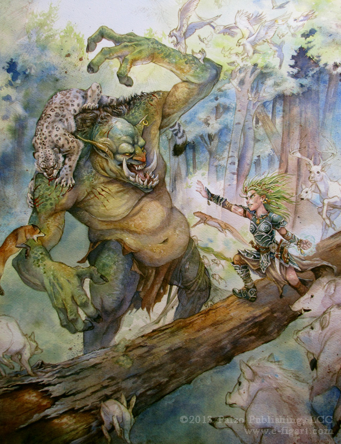
I mentioned in my previous post that the Animal Archive cover painting was one of the most complex I have ever done. I read over the art order for the job, thinking, "This is going to be awesome!...This is going to be hard!" I would need to tackle a high level of detail, rendering dozens of creatures in the scene, and still make the illustration readable.
Balancing out the composition began at the thumbnail stage. I did
numerous thumbnails for the illustration. I narrowed them down to the
five I felt were the most successful.
We went with number three, though I liked numbers one and four as well.
Often, when working with a complex scene, I will draw important characters separately, so that I can put as much detail into them as I would like, and then I'll collage them together in Photoshop later. I used this technique (if you can call it a technique) for Animal Archive, as well as for the cover to my book.
I did the drawing for the hero character, Lini, at a larger size than needed for the final composition.
After drawing all of the animals either in my sketchbook or on tracing paper, I grouped like animals on their own layers in Photoshop. The rough drawings below show how I experimented with those layers before settling on a final composition. I had to make sure there would be room at the top and bottom for text without the image being so busy as to make it indecipherable.
I spent lots of time drawing that leaping boar in the bottom right and ended up having to sacrifice him for the title.
The fox on the left would eventually be eliminated as well.
The final drawing. I found a way to get that boar back in there, at least partially!
I don't usually have progress shots of my paintings, since they are mounted to a board as I work, making them very difficult to scan, but in this case I took a couple digital photos along the way.
This is usually the stage where I start to panic because I feel like I've forgotten how to paint!
The final gouache painting.
I was asked to change Lini's magic to fire magic, which I painted in Photoshop to complete the cover image.
The cover with title and Pathfinder logo.
During the course of working on the illustration, I feel as though I lost some of the forward momentum of all of the animals and the compositional punch of the lines converging on the troll's face, both more apparent in the thumbnail. (James Gurney coined a great term for this compositional device: spokewheeling.) I was happy with what I was able to accomplish with this painting, though there is certainly room for improvement next time.
Why do so many life drawings of animals feature reclining poses? (Hint:stop moving!)
Before creating the simple gouache painting I made to celebrate 2013, I did a few quick rabbit studies while playing with my bunny friend. Most of the sketches took around a minute or two. He didn't sit still for much longer!
As I explained in Part 1 of this series, due to time constraints and
other considerations, I decided I would draw and paint the cover illustration
in separate layers, scan in the
pieces, and use Photoshop to complete the image. With the drawing and color comps finished, next I needed to decide which creatures to group together for each painting piece. Those that were overlapping each other made the most sense to paint together.
I decided to paint the background, forest behemoth and flying fish as one piece which the other paintings would eventually be layered over.
Then, I printed the sand dragon, Marmoken warrior, sphinx and chimera on one piece of watercolor paper, and the Minotaur, crowned ibak and hydra on another.
The remaining creatures (the glass dragon, Paki, pancake glider, hook-legged bodeo, and lantern bat) would all be painted separately.
"When using gouache, watercolor paper is a great surface. Depending on your preference, you can use a cold press paper, which has more texture and is able to hold large amounts of water for very wet washes, or hot press paper which has a smooth finish but can not hold heavy washes as easily. This demo was created on 140 lb. Arches cold press watercolor paper.
If you have access to a scanner to scan your drawings and a printer that can handle watercolor paper, the easiest way to transfer your finished drawing down to the paper is by simply printing it! Consult your printer's settings to see what size, shape and thickness of paper your printer can accept. Another option is to take your drawing files to a local print shop to see if they can print it on watercolor paper for you. You can also transfer your drawing the old fashioned way, using a light box to trace your finished image onto your watercolor paper. If you're feeling confident, you can also start a fresh drawing directly on the paper you plan to paint on. In that case, no transferring is necessary!
Once your drawing is transferred down to your paper, it's time to secure the paper to a rigid surface for painting. Watercolor paper tends to buckle when a lot of water is used, especially at the wash stage. If you don't want to deal with annoying ripples and wrinkles in your paper, stretching the paper is the answer.
1. Prepare a rigid surface, preferably any type of board that can handle staples. If you can find a wood soft enough, you can use a light duty staple gun to staple your paper down. If you prefer not to staple your paper, you can also use brown gum art tape, which sticks the painting to the surface when wet. You must leave space on the sides of your painting when you use this tape, however. Because it sticks permanently to the paper, it must be cut off of the painting when you're finished.
2. Fill a utility sink, large basin, or even bathtub with water a few inches deep. Immerse your watercolor paper in the water for 2 or 3 minutes. When you remove the paper, hold it up and allow the water to drain off the surface. The paper should be thoroughly saturated after having soaked up water.
3. Spread the paper out onto your board and staple all around the edges, keeping the staples a few inches apart. Make sure the staples are close to edges of the paper, not in the actual image area of your illustration. You don't want holes in your final picture!
4. Tape off the edges of your painting with artist's tape, up to the borders you wish to define. This will give your painting a crisp edge and will avoid water spillage over the sides of your paper, preventing a big mess.
After your paper has been stapled down to your board and is completely dry and flat, it's time to start painting!"
Want to see this process step by step?
Then watch this excellent demo of the paper stretching process made by Terese Nielsen:
A few years ago I accepted a project on which I worked mostly in my off-time...mostly. It was a project that unexpectedly spanned several years, much to the dismay of the small and dedicated group of people with whom I was working. I was happy with what I was doing, but incredibly embarrassed about the length of time it was taking me to do it. The project was a privately commissioned sculpture of Link (from the Legend of Zelda video game series) that would become a model kit for the group members' personal collections––not to be reproduced or sold.
When I finally completed the sculpture, I sent it to Joachim Höstlöf for clean up, and a few months later, I received my copy of the kit from the project coordinator, Derek Kan. I admired the excellent casting job, then carefully packed the kit pieces away in a box, hoping I'd have the time to put it together and paint it someday.
Derek's kit was completed last December, and he's sharing the process of the sculpt's creation from its humble wire armature beginning, to its beautifully painted completion on his website.
The finished kit, painted by John Allred.
I would not have been able to finish the sculpture without the encouragement of the group, and definitely not without the help of Joachim, the very talented model builder and sculptor who made the beautiful shield and swords and prepared my sculpture for the the molding and casting process.
The Cover Painting: Color Comps It's hard to believe, but it's been a whole year since I last posted about the making of The Explorer's Guide to Drawing Fantasy Creatures cover. Whoops! Instead of making another massive post, I've decided to break up what's left into more manageable segments with the hope I can finish the series in a more reasonable amount of time. In Part 1, I discussed the process of creating the drawing for the cover to The Explorer's Guide to Drawing Fantasy Creatures. Now I'll move on to the making of the painting. First, I wanted to do some color comps. Since the creatures had all been painted previously for the book's interior art, I already knew what colors to make them. But I still needed to work out exactly what I wanted to do for the background of the image. I knew I wanted something simple since the focus is on the creatures. Additionally, I needed to leave some space uncluttered for the cover text. I also wanted a very colorful cover, so I skipped what would typically be the part of my color study process where I try to work out a specific color palette. To do the studies, I printed several tiny versions of the cover drawing onto a piece of watercolor paper and blocked in the color quickly with gouache. I only painted the creatures once, painted a few backgrounds, and then scanned everything in and played with various combinations in Photoshop.
Study number two became the model for the final cover image.
Over the last several months I completed several private commissions. Most came to be after having conversations with Gen Con attendees who had taken an interest in my work. I've done a lot of drawings for people during and after conventions, but this was the first painting I did for a private collection. Rather than conforming to an already existing style guide, commissions are an opportunity to call upon my own internal style guide–something the client is seeking when they ask me to create artwork for them.
Sometimes I like to examine the drawing and the painting of an image side by side. They're fundamentally the same image, but end up looking quite different once value and color are added. There are things about this character I like better at the drawing stage and things I like better at the painting stage. (Sometimes I like an entire image better as a drawing rather than a painting and vice versa.)
Here, I like the expression in her eyes better in the drawing. There's some subtle emotion that I feel I lost once I went to paint. But the painting has volume and warmth that the linework lacks.
What do you think? Are there aspects of one you like more than the other? You're welcome to discuss in the comments!